ALBERT RENGER-PATZSCH
NEW OBJECTIVITY
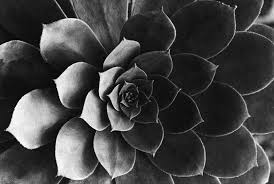
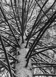
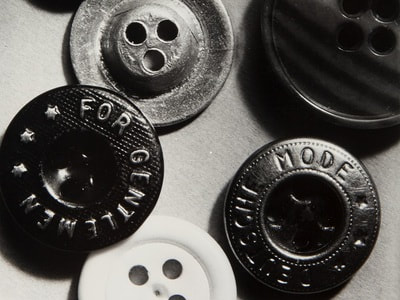
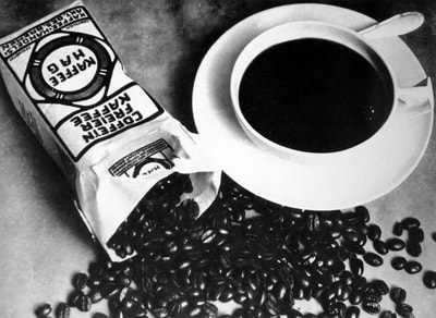
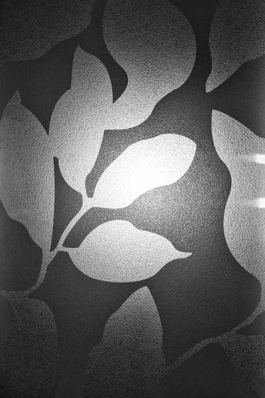
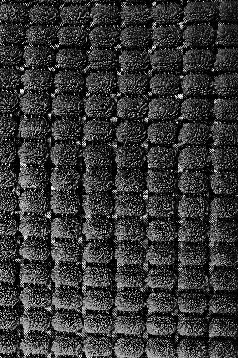
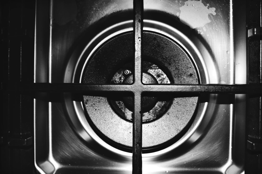
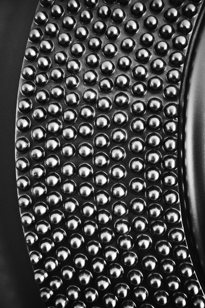
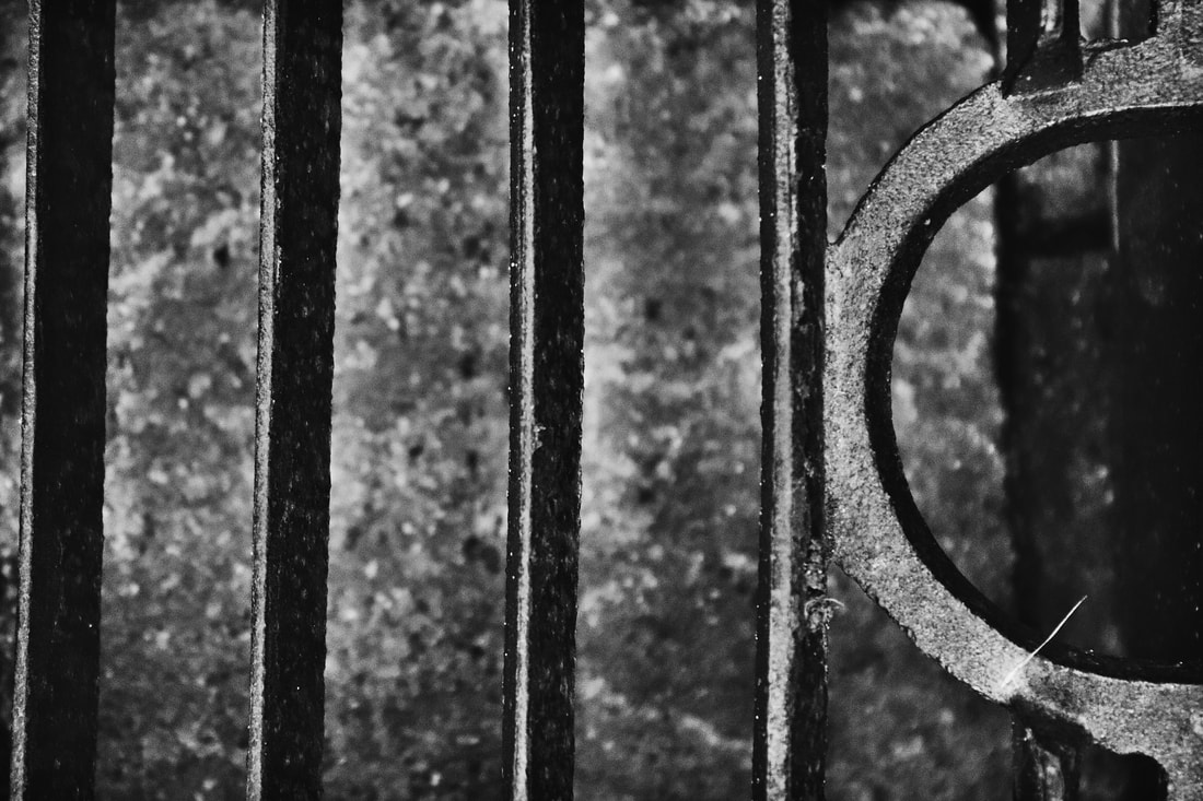
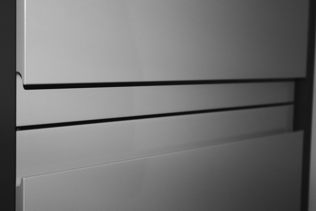
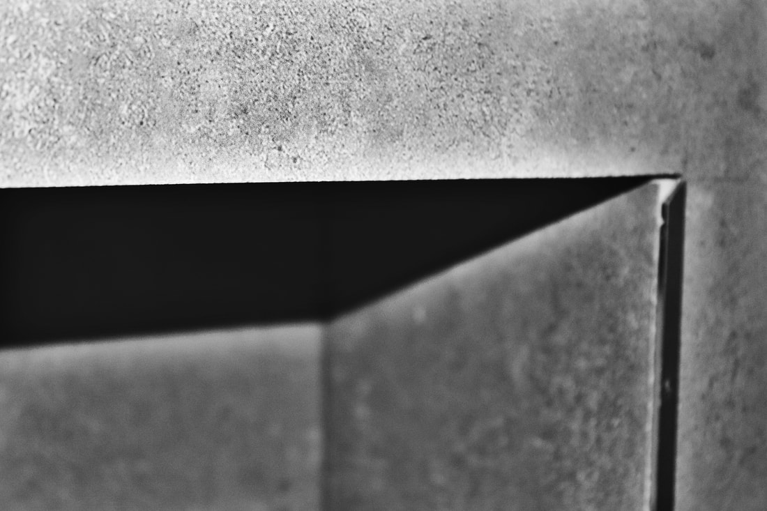
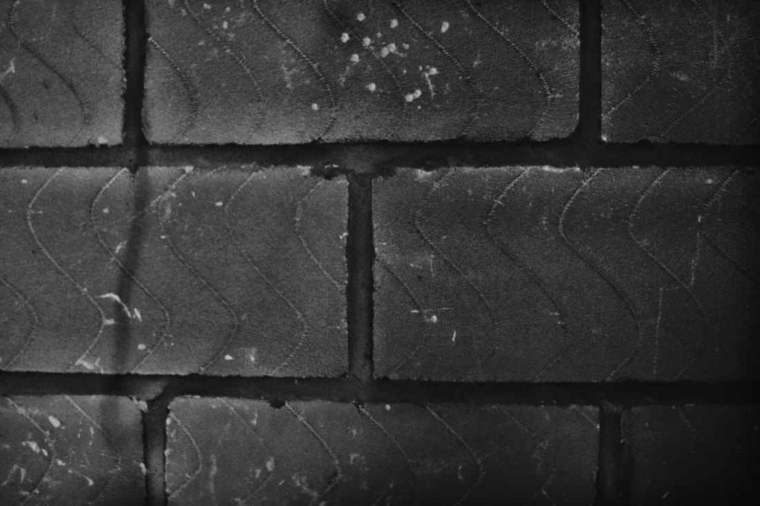
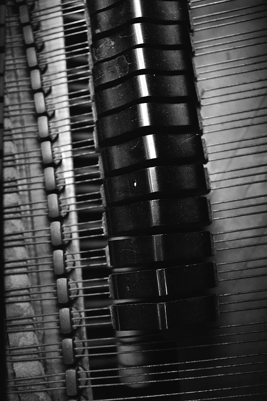
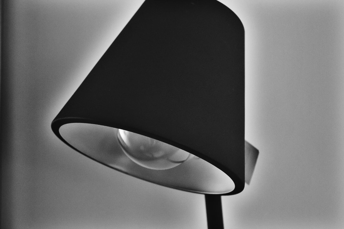
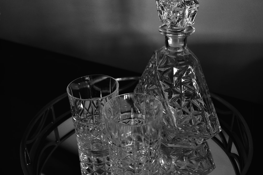
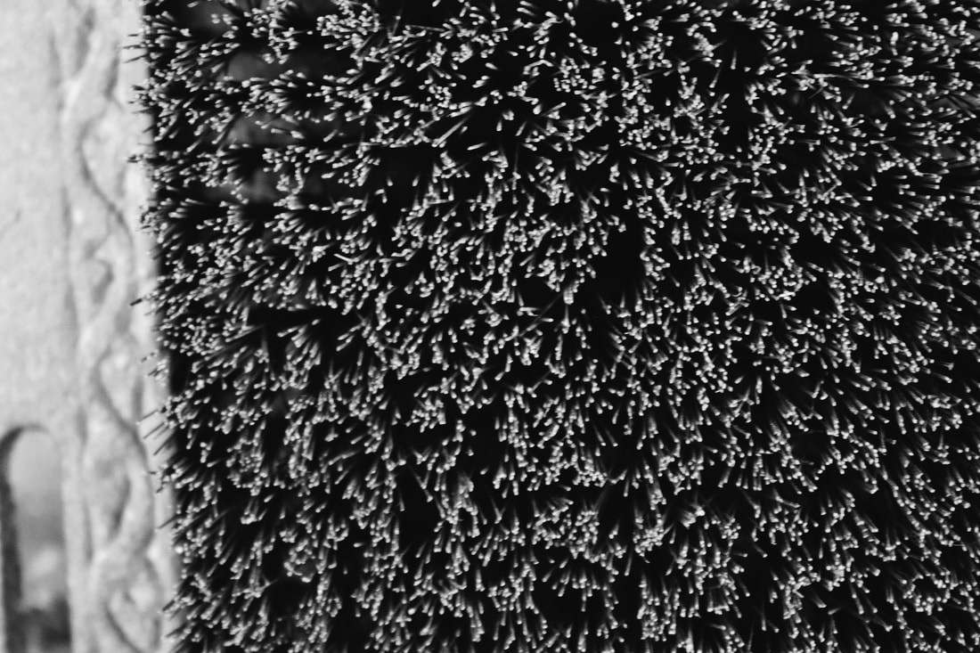
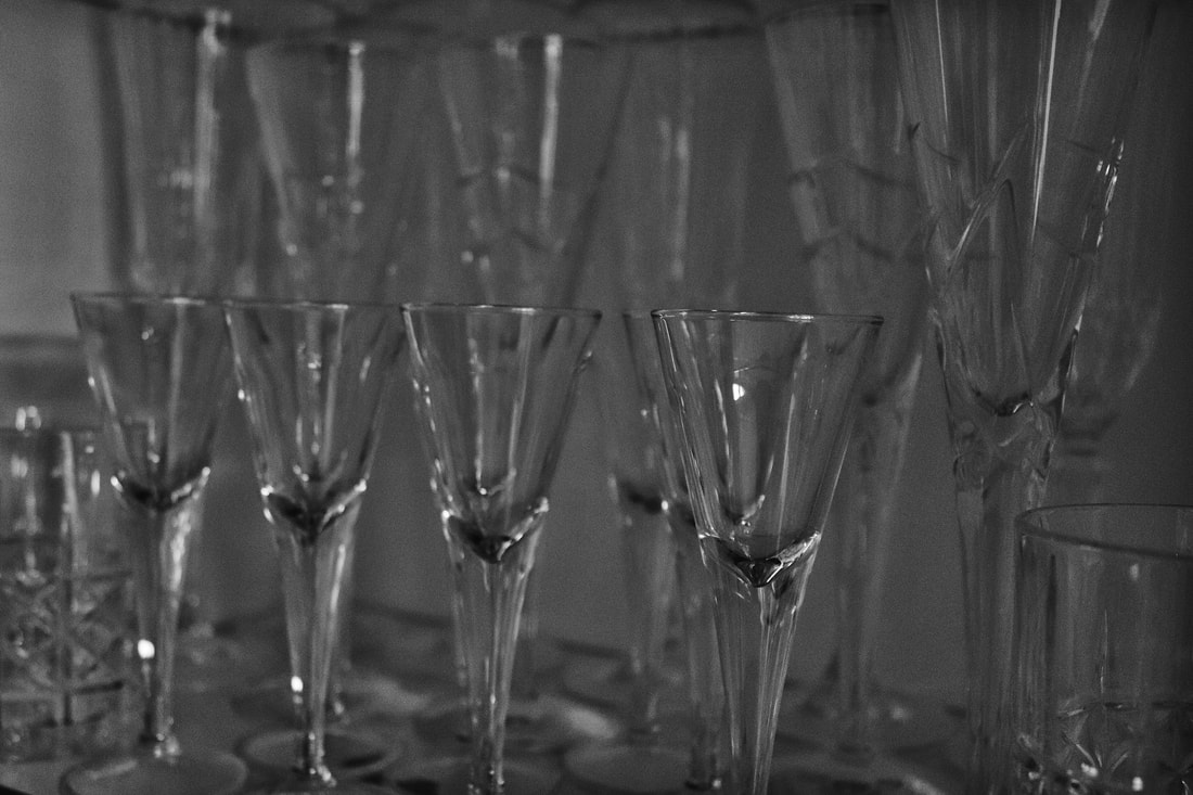
New objectivity was a German movements which arose in the 1920's as a reaction to expressionism. It was a movement in which photographs would mainly focus on the subject, being up close and showing every bit of detail the subject holds. This is shown greatly in Albert Renger-Patzsch's work as the majority of his photographs are all focusing on the subject which he is photographing. Renger-Patzsch photographed all his photo's up close with minimal background showing. Each photograph Renger-Patzsch show's off the detail in which the subject holds. Each image holds its uniqueness of detail from lines to shapes, to patterns. Some of his images are similar and focus on one subject and its detail, whilst others are a collection of subject which go together e.g. coffee beans and a coffee mug (shown below), which also show's off the shadows and reflection which are also presented in his work. Repetition also plays a big role in Renger-Patszch's work as some of his images shows a repeat of the subject which creates patterns, which also play a huge role in his work.
NEW OBJECTIVITY
New objectivity was a German movements which arose in the 1920's as a reaction to expressionism. It was a movement in which photographs would mainly focus on the subject, being up close and showing every bit of detail the subject holds. This is shown greatly in Albert Renger-Patzsch's work as the majority of his photographs are all focusing on the subject which he is photographing. Renger-Patzsch photographed all his photo's up close with minimal background showing. Each photograph Renger-Patzsch show's off the detail in which the subject holds. Each image holds its uniqueness of detail from lines to shapes, to patterns. Some of his images are similar and focus on one subject and its detail, whilst others are a collection of subject which go together e.g. coffee beans and a coffee mug (shown below), which also show's off the shadows and reflection which are also presented in his work. Repetition also plays a big role in Renger-Patszch's work as some of his images shows a repeat of the subject which creates patterns, which also play a huge role in his work.
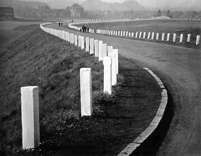

COMPARING HIS WORK

|

|
|
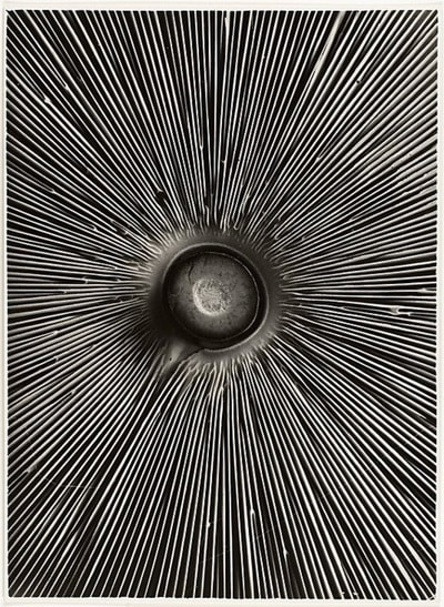
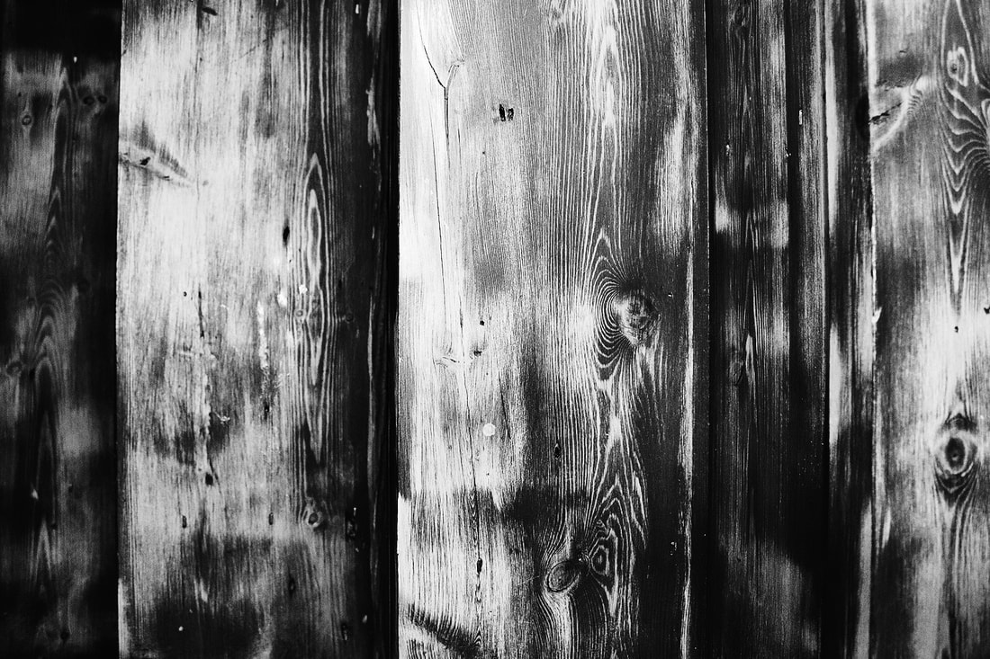
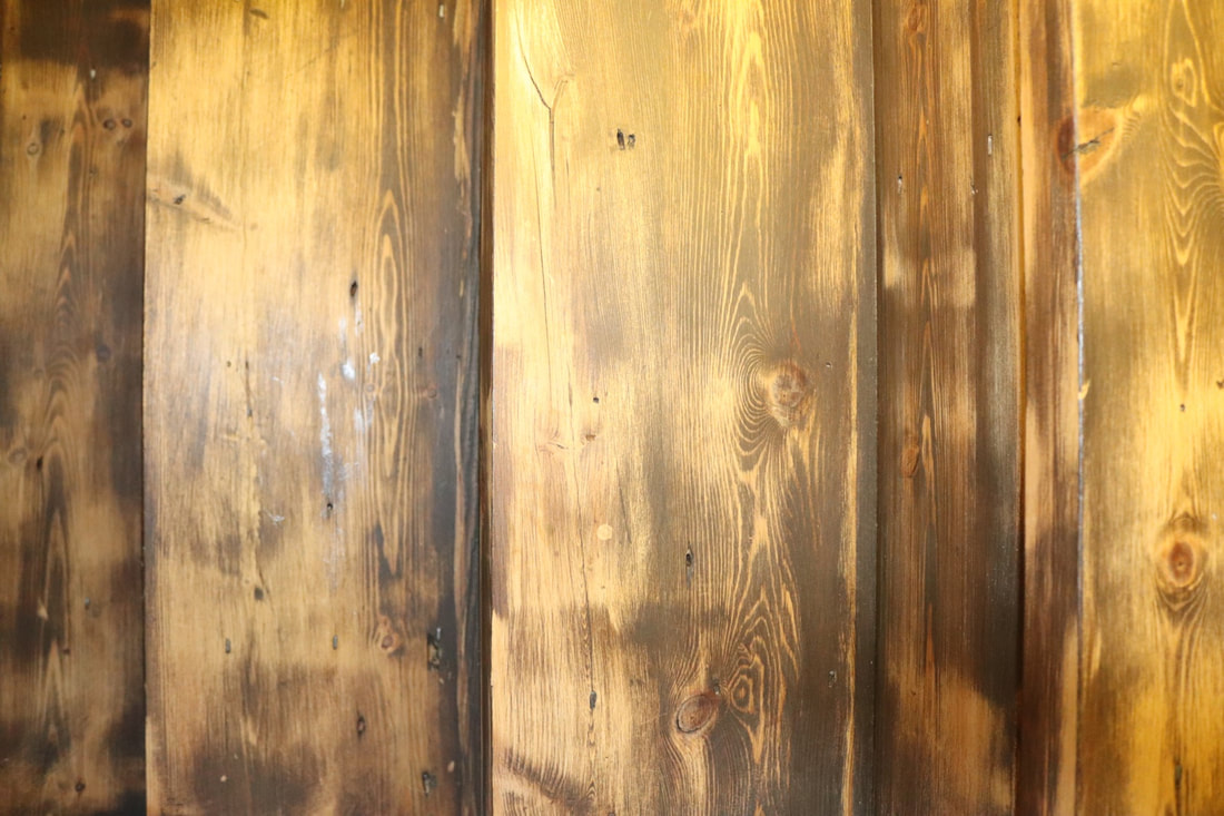
NATURAL SUBJECT
- Dark. - Black and White. - Shot outside as the image is up close the subject looks. really big and because its a tree I believe it would be outside, but because theres little background its hard to tell. - Shot long side to give it a rectangular crop. - Detail- There's a lot of lines, both thick and thin - Natural lighting, why the image comes across as a lot darker and because there are a lot of shadows from the branches and main trunk. |
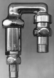
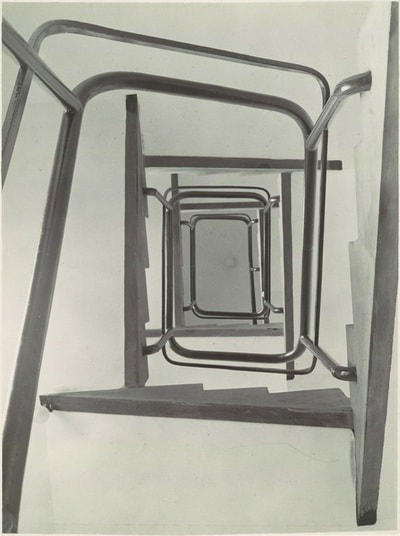
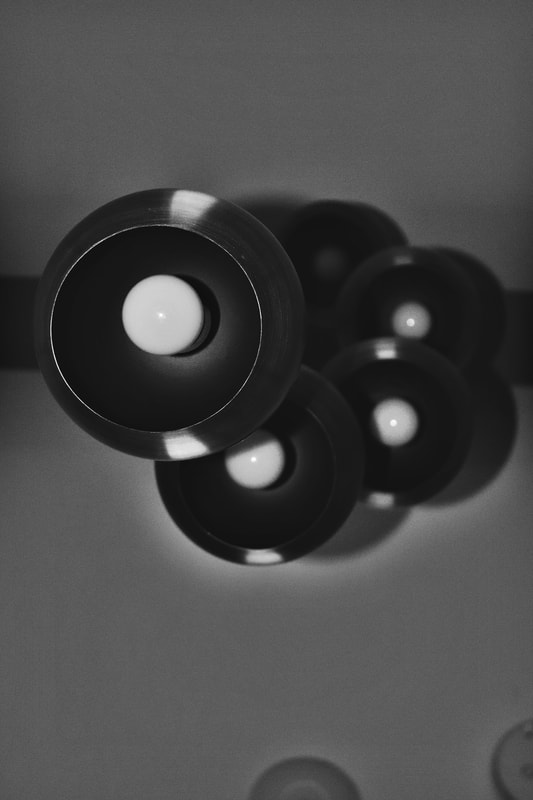
MAN MADE
- Light (easy to tell what the image is). - Possibly colour - Also has a rectangular shot - rectangular shape which it repeated. - Spiral pattern of the stair case, a continuous rectangle. - Shot inside a building - Theres no trace of a electrical light nor windows so I'm not entirely sure if it contain natural or man made lighting but from how bright it appears at the bottom and how the white gradually gets darker towards the top I would say maybe man made lighting at the bottom then at the top no light or possible natural lighting (through a window) |
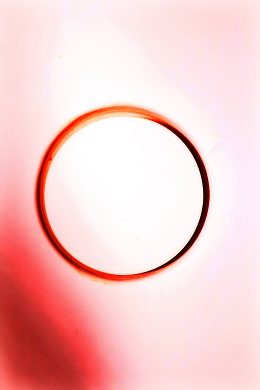
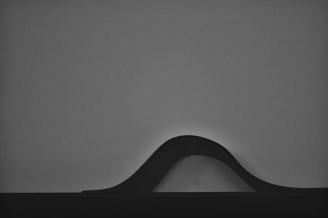
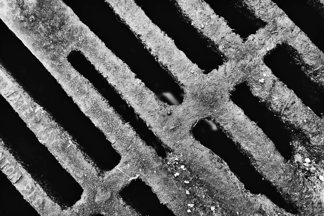
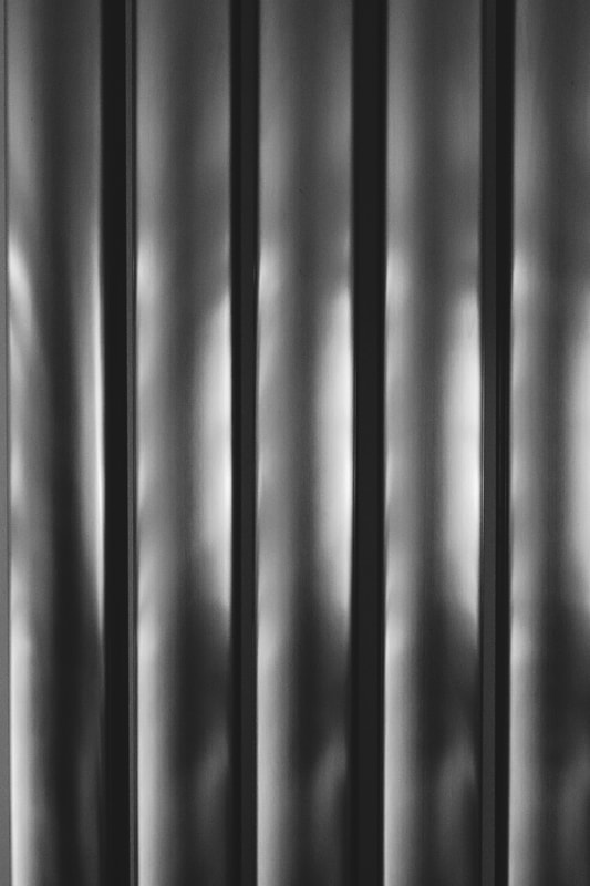
THE WORLD IS BEAUTIFUL: MY RESPONSE


EVALUATION
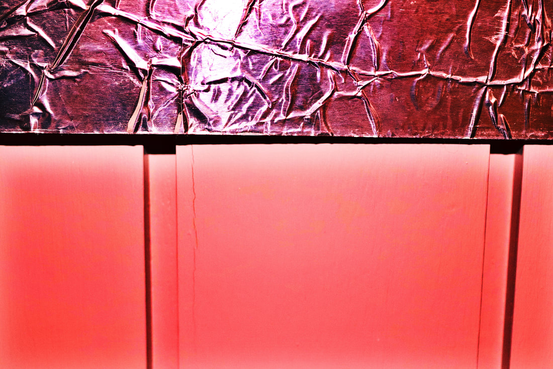
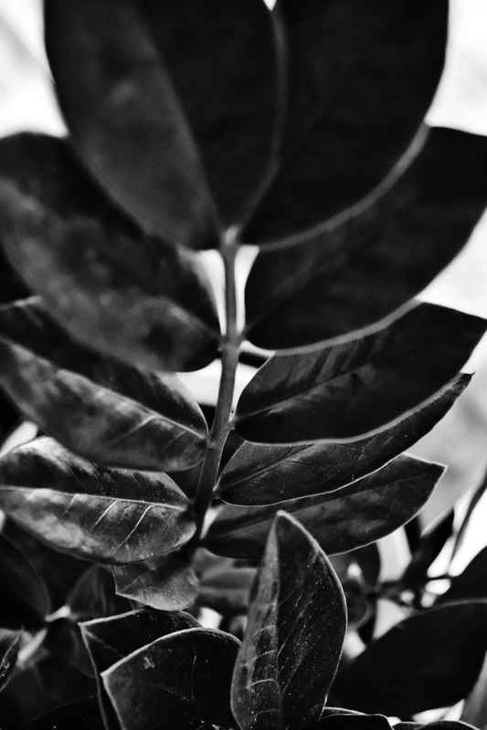
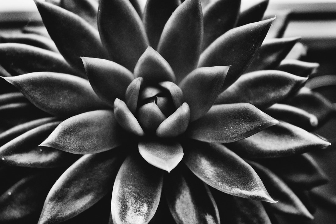
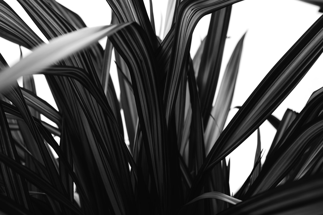
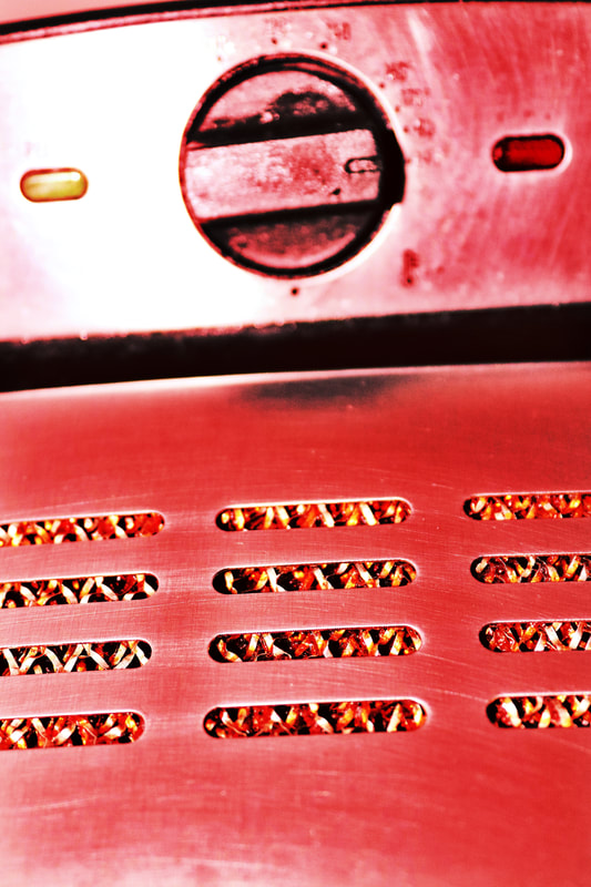
From looking at my photographs, I think that its quite clear that Renger-Patzsch was my inspiration. This is because of the detail, patterns, repetition and black and white theme, which both mine and Renger-Patzsch photographs have. When I was taking my photographs I thought a lot about the patterns I wanted to incorporate and I chose to focus on subjects that contain a lot of lines as I felt that these were what most of Renger-Patzsch images contain. A lot of my images where taken inside but the subjects were taken in the natural light which was coming through the windows and the rest/most of the plant images were taking outside in the natural sun. I took the images with my phone and altered them on this iPhone app called "Afterlight". With my black and white images I first added a black and white filter called "Raven", I then decreased the brightness of the images to add that Renger-Patzsch theme, then went on to increasing the clarity, contrast, saturation and then increasing how sharp the images appeared which resulted in the images coming out like so. The red images I also edited on the app, I did not add a black and white filter to these images but instead I added a highlight tone, mid tone and shadow tone, all of red and then to make the colour pop a little more and be a little more bright I increased the contrast and saturation.
I feel like these images were a successful interpretation of Renger-Patszch's work and also allowed me to get used to going right up to a subject and making sure all the detail in there (on top of experimenting with app's and changing pictures).
