DENOTATION, CONNOTATION, STUDIUM & PUNCTUM
DONOTATION (NOUN): "The action of indicating or referring to something by means of a word, symbol etc".
CONNOTATION (NOUN): "An idea or feeling which a word (in this case a photograph) invokes for a person in addition to its literal or primary meaning".
PUNCTUM (NOUN): "A small, distinct point".
STUDIUM: "Is the element that intionally gets your attention. It can be colours, a cool background, a pose, really anything".
For the second photograph we had to firstly write down the stadium which was a lot harder as we had to write what we see/what we can tell from the photograph (that may not necessarily be true). Secondly we then had to find the punctum, where i had to describe how it makes me feel and what the image is expressing, is it personal? or is it due to society at the time? It eas intresting as you are in a way creating your own ideal story off this photograph. |
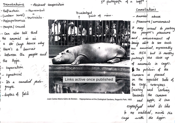
In class we were given these two images. One of a photographs were a hippo and one of children. With the first photo we had to find the denotation and the connotation. For the denotation part we had to write all we could see but not just subject wise but lighting, composition, abstract form. etc. For the connotation part we had to write what the image portrayed to us other than just the subject, what message to me does the photograph portray e.g animal abuse/for amusement. 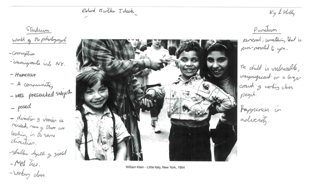
|
|
|
Before I done any work on the class work about these mediums. I wanted to get a better understanding and so I researched and found this youtube video which was actually really good and detailed! It really helped with my undertsanding and recommended it to a class mate |
HOMEWORK:
Our homework was to do what we done in class with out own images and also someones else's. I wanted to make sure for this I chose 2 photos which spoke to me more on a personal level, rather than just taking any photograph. The photo i chose which is my own is a portrait i took of a friend which seems on the surface to not have that much about it but really is does. The second photo i chose was one I from Sally Mann's collection called "Family Pictures" as its a collection I really like and think says a lot.
Our homework was to do what we done in class with out own images and also someones else's. I wanted to make sure for this I chose 2 photos which spoke to me more on a personal level, rather than just taking any photograph. The photo i chose which is my own is a portrait i took of a friend which seems on the surface to not have that much about it but really is does. The second photo i chose was one I from Sally Mann's collection called "Family Pictures" as its a collection I really like and think says a lot.
|
|
|
DONOTATION:
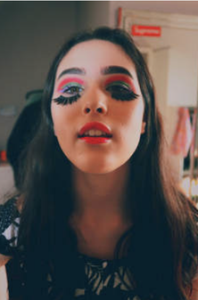
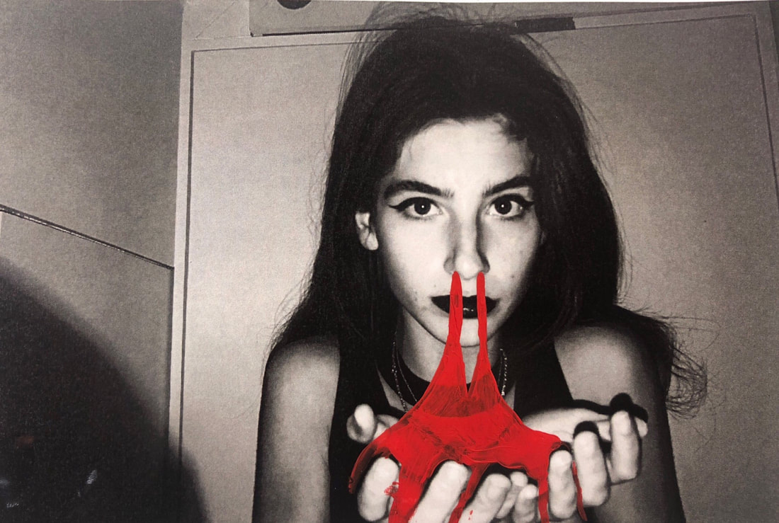
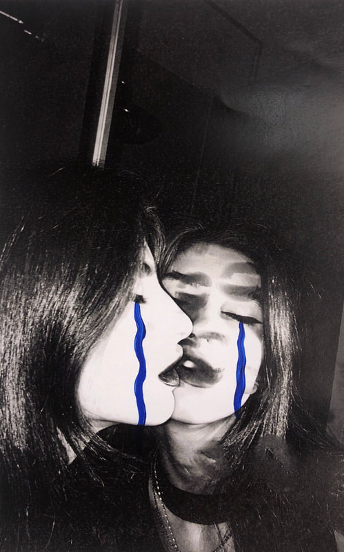
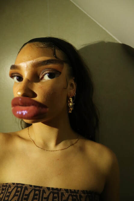
-Unusal -Reflection -Saturation -Portrait -Close up -Textured (skin) -Blurred background -Focused, clear foreground (of the subject) -Colour vibrance CONNOTATION: The photograph shows off a teenage, female subject. Who has clearly got exaggerated makeup and a sense of humour due to the miss use of false eyelashes. The lighting is a mix between shadow and brightness has half her face is submerged in a slight shadow and the rest is exposed to light. The background is blurred out and out of focus, where as the foreground is in focus and clear; making sure the subject has all the viewers attention. The photograph express youth through saturation and the vibrance of its colours/ and the use of contrasting colours. STRUDIUM: -Humour -Youth -Calmness -Happiness -Relaxed facial expression, more on the the natural side. -A caught in the moment photograph, quick shot (not over the top posed but neither candid). PUNCTUM: Happy and humorous as she wears eyelashes in a weird, unique way; making the photograph more strange and curious in a way that the viewer wants to know what joke or what was happening when this photograph was taken. Expression of her femininity, how she expresses herself through colour and quirkiness. Stereotypical 'girl colours', pinks and purples not much of a diverse between gender image. Really feminine. |
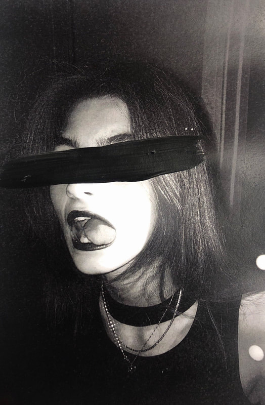
DONOTATION:
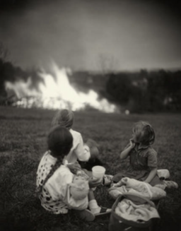
-Dark -Blurred background, clear focused forground -Knee height shot -Camera is the eye of a fourth party -Black and white -Disguised -Candid -movement CONNOTATION: The image shows three young girls witnessing a fire happening not too far off from where they are sitting, supposedly playing with their dolls. They are in main focus but they are turnt away from the camera. The camera seems to be at the same heigh of their heads sp possibly knee height on an adult. The background holds a fire which it blurred and from the use of black and white imagery it looks like one white smug on the photo. The air seems gradiant and a mix betweeens black and greys, grainy and looks unbreathable almost. STUDIUM: -Danger -hazardous -Safety -Calmness -Unbothered -disguise PUNCTUM: Sad and dark image. mysterious because you don't know what the fires really about! Is something on fire? What caused the fire? Expresses innonce because they girls are harmless and unharmed in the photographed, they are only intrigued. But contrasting with this, it could also be ecpressing danger, these girls may be innocent but they could be harmed and they are still sitting down showing that they are unware of danger. |
John Hillard "Cause of Death"
"John Hilliard, (born 1945) is an English conceptual artist.[1] Hilliard's ongoing body of work addresses the specificity of photography as a medium: its uncertainty as a representational device and its status within the visual arts, especially in relation to painting, cinema and commercial photography"
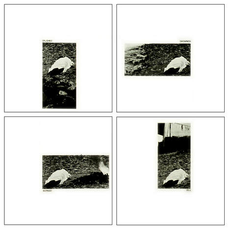
Above is one of Hilliard's most famous photographs, called "The Cause of Death". Its a photograph which is made up of four images. The image is made up of four separate causes: 'Crashed', 'Drowned', 'Burned' and 'Fell'. He's taken four images of the same subject but from four different perspective/angles. Each change in perspective, changes the concept of the image. This lighting changes in each photo, as well as the gradient (dark to light or light to dark). Each perspective fits with each cause. For example, 'Fell' is a portrait photograph and is longer than wider which gives of the impression the subject came from above (fell from above), this is also shown as the subjects laying on the ground and you can see in the background a ship (insinuating that the body fell from the ship). The course 'Burned' looks as if the subject is laying next to a fire due to the light exposure, its caused the impression that theres a fire, adding to the concept of the photograph and giving the illusions that the body was burnt. 'Crushed' looks as if the subject is higher than when Hilliard took the photograph and that there are rocks under where the subjects laying, this causes the idea to approach that the subject was crushed by these rocks. The last one called 'Drowned' has a concept of a lighter left side of the sea, whilst the other contains the subject and ground. This expresses the idea that the body was possibly drowned as its positioned next to the sea. The way Hilliards used four different perspectives to show four different causes is unreliable, as all these things didn't happen to the body as they are put together but if they were separately the image would come across as a reliable cause as each perspective fits with the concept of what was said to have happened (drowned, burnt, fell and crashed).
Above is one of Hilliard's most famous photographs, called "The Cause of Death". Its a photograph which is made up of four images. The image is made up of four separate causes: 'Crashed', 'Drowned', 'Burned' and 'Fell'. He's taken four images of the same subject but from four different perspective/angles. Each change in perspective, changes the concept of the image. This lighting changes in each photo, as well as the gradient (dark to light or light to dark). Each perspective fits with each cause. For example, 'Fell' is a portrait photograph and is longer than wider which gives of the impression the subject came from above (fell from above), this is also shown as the subjects laying on the ground and you can see in the background a ship (insinuating that the body fell from the ship). The course 'Burned' looks as if the subject is laying next to a fire due to the light exposure, its caused the impression that theres a fire, adding to the concept of the photograph and giving the illusions that the body was burnt. 'Crushed' looks as if the subject is higher than when Hilliard took the photograph and that there are rocks under where the subjects laying, this causes the idea to approach that the subject was crushed by these rocks. The last one called 'Drowned' has a concept of a lighter left side of the sea, whilst the other contains the subject and ground. This expresses the idea that the body was possibly drowned as its positioned next to the sea. The way Hilliards used four different perspectives to show four different causes is unreliable, as all these things didn't happen to the body as they are put together but if they were separately the image would come across as a reliable cause as each perspective fits with the concept of what was said to have happened (drowned, burnt, fell and crashed).
CAMERA LUCIA:
Here are 10 key points that interested me from the 'Camera Lucida' text:
- Roland Barthes wasn't sure if photography existed and stated it had a 'genius' of its own.
- Photographs reproduces to infinity and occurs only one; the camera shutter is faster than a blink of an eye.
- Photographs consists of a referent and signifier. The referent is the subject of the photo and the signifier is the medium the image is printed onto.
- Photograph can't be distinguished without destroying the two elements.
- The photograph is always invisible, not IT that we see first, we see the subject first.
- A photograph is object to 3 practices: to do, to undergo, to look.
- Operator is the photograph, Spectator is ourselves, the person or thing photographed is the target.
- Posing in photographs do not portray the model's individuality.
- 'Cameras are clocks for seeing' - each photograph is a mark of time that you can't get back.
- There are two elements within the photo which interests Roland Barthes which he calls: Studium meaning to study in latin and Punctum disturbs the studium as it means to sting and cut.
SURREALISM
(The unknown but known in the everyday)
"Surrealism lies at the heart of the photographic enterprise: in the very creation of a duplicate world, of a reality in the second degree, narrower but more dramatic than the one perceived by natural vision."
-- Susan Sontag,, 1977
Surrealism is a form in which everyday objects or landscapes are photographs but presented in an unusual way. In a way which people know what the photograph is of but has something added to it to make it odd. The idea of surrealism is to make people want to look at the ordinary and to present it in a way which will MAKE them look. Its sought to release the creative part of the unconscious mind like an irrational juxtaposition of a photograph (placing the known with the unknown). Surrealism grew from the project in Paris called 'Dadaism', (1924) which showed the corruption of the war (first). The surrealism of the dada found its way quickly to photography in Walter Benjamins 'the optical unconscious'. "The camera sees the world differently to the human eye. Photographs are abstractions. They freeze time, making the scene photographed available in perpetuity. Photographs have edges. They collapse space, creating new and sometimes unlikely relationships between objects that were not previously connected. In the hands of the Surrealists (and successive generations of photographers) the camera became an instrument for creating new visions".
VIVIANNE SASSEN
Sassen is a female photography whom was born, 1972, in Amsterdam, Holland. She studied fashion design which she then followed by studying photography at Utrecht School of the Arts (HKU) and Ateliers Arnhem. A lot of her work is a retrospective of fashion photography and surrealism. She has had man solo exhibitions, displaying either her fashion or cultural subjected photographs. She holds many works. I am mostly looking at her collection of work called 'Heliotrope', which explores the normal presented in an editorial unique way. Heliotrope, 2017
'Heliotrope is a collection of images in which Sassen investigates new ways of image-making, altering images that she shot on recent travels to Ethiopia, Morocco, Mozambique, Senegal and South Africa. “I aim at subverting the way I look at them, and at the world. Colour, graphic shapes and shadows are my tools to revisit, reinterpret and gather a different understanding of what seems familiar. The ordinary and the magical merge. The series is underpinned by the impulse to explore unknown territories, physical or metaphorical'.
'Heliotrope is a collection of images in which Sassen investigates new ways of image-making, altering images that she shot on recent travels to Ethiopia, Morocco, Mozambique, Senegal and South Africa. “I aim at subverting the way I look at them, and at the world. Colour, graphic shapes and shadows are my tools to revisit, reinterpret and gather a different understanding of what seems familiar. The ordinary and the magical merge. The series is underpinned by the impulse to explore unknown territories, physical or metaphorical'.
"HELIOTROPE"

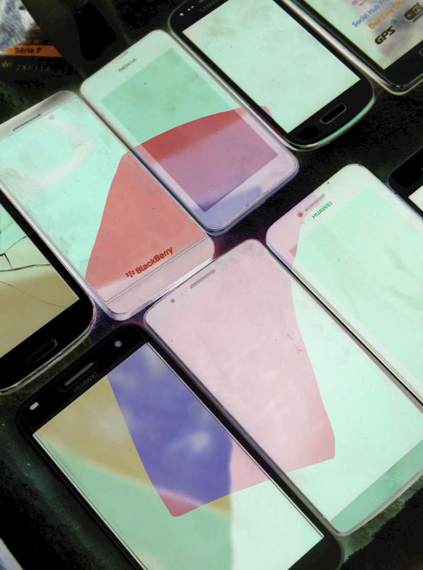
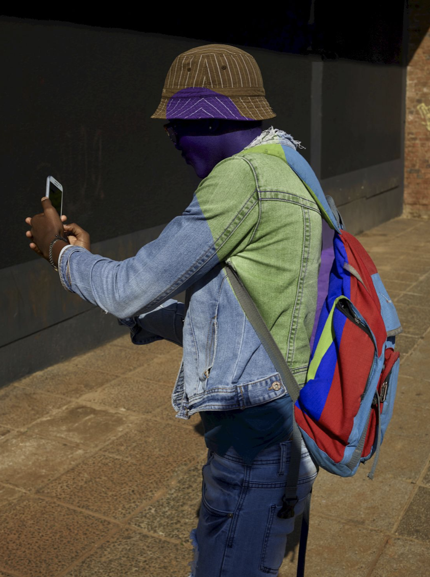
What I like most about Sassen "Heliotrope" is the colour and the way the unnatural mixes so well with the normality of the photograph and the subjects. The first image is bold because, firstly the blue stands out but the subject is so boredered off and so centered that it draws most of the attention. The phones look as if they are being xrayed and expresses a sense of supernatural. The contrasting colours, placed oppositly in triangles, contrast well against the black boarders of the actual phones. The guy looks candid and doing a normal thing, taking a photograph but by Sassen overlaying him with colours, adds a contrast to his skin tone but also to the whole outfits and image, its not just "a man taking a photo with his phone", it is a "a man taking a photo with his phone, who's been exposed to these over laying of colours which make it all more interesting".
RESPONSE (to Vivenne Sassen)
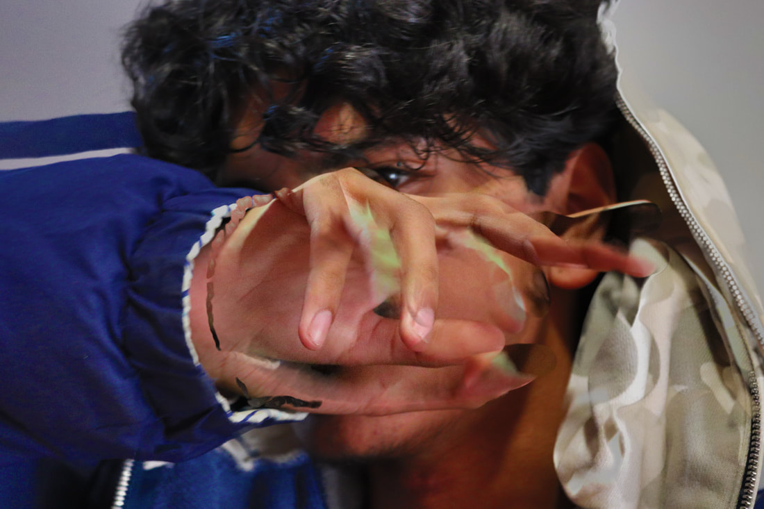
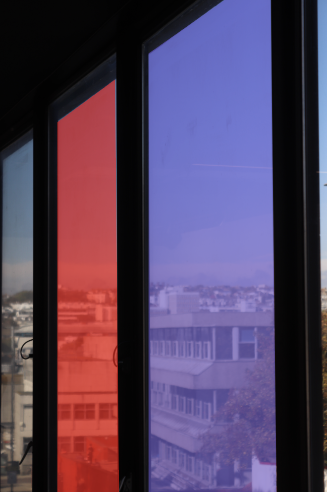
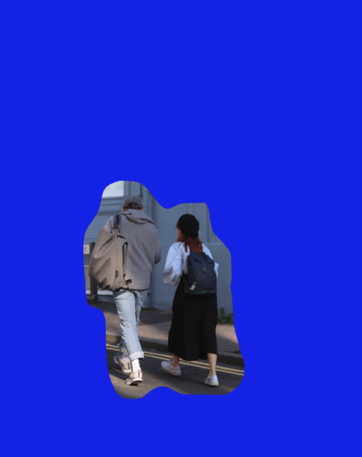
CONCLUSION: The first image I took over a year ago, to test out the setting on my new camera and when I saw Sassen's work it reminded me of this picture, so i included it. No editing was need for the picture (it was on automatic setting) but my subject moved when i took the photo which resulted in it looking disfigured and quick movement. The second top photo i took on a Brighton trip through a window, i took the photo into photoshop, where i took the pen tool and marked around the window with i then filled with a colour, one red and one purple. I then lowered the opacity so that they became see through as i still wanted to be able to see outside. I like this photo because the windows just look tinted and the fact that the background view isnt in focus. The bottom left is my favourite out of the four, this is because of cool it looks. Its asif i have taken away some of the blue and underneath were these people and it really lets it focus on the main subjects. I also like that they are walking away, in action photo thats candid. The last photo i inverted some of it to look xrayed. The green and purple contrast but i think it looks a little too fake or edited which clashes with Sassens ideal. The photo is of abstract walk way with escelators above but you cannot really notice that which take away the fact it needs to hold something everyone can notice.
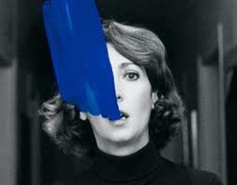
HELENA ALMEIDA
|
is a Portuguese multi-disciplinary artist best known for her performances regarding the body and its relationship to painting. Her work expresses a series of mostly black and white photographs which connect with the paint, she then uses to complete the photograph. Instead of using a plain canvas to paint on, Helena uses her photographs as her canvas. A famous photograph she has is one where theres water being poured into her mouth. Her works mostly in black and white because it contrasts well with the blue paint she uses ontop to create water! Her photographs are self portaits she had taken of herself. Which to me is actually important because its hard to always have someone at hand to photograph.
|
|
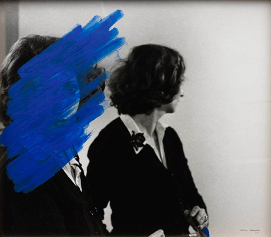
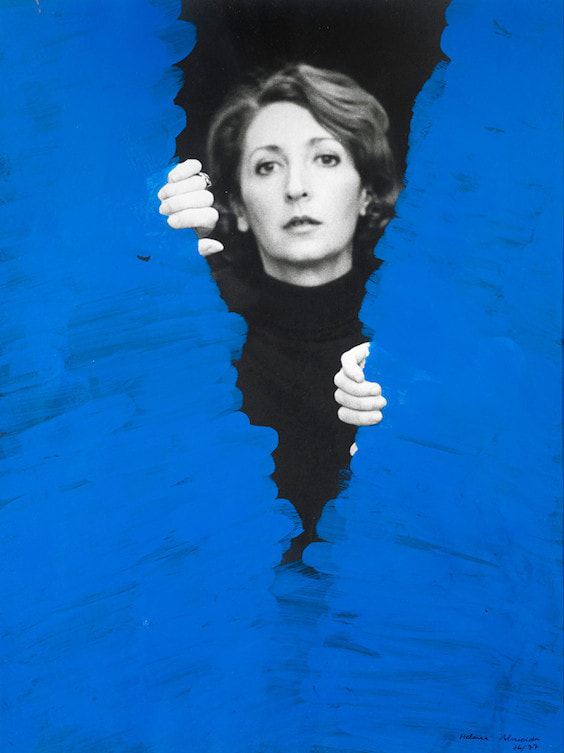
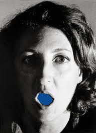
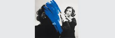
These four photographs are my favourite out of all her collection. This is because the first two on the left make sense and I feel a personal connection to the mirror impression photograph, its a unique way to present yourself in disgues and always looking away from whats there (enhancing something that would normally be there via disgiuse). The opening up of the blue paint is interesting, the way she has positioned herself so that the paint fits perfectly in her hands it really satisfying. The blue mouth i generally thought was cool because its unusual its not what you would normally see if you opened your mouth! The last photo on the right links to the first one and its a photograph shes painted on top but its looks like shes painting in the picture which i think is ironic and interesting.
RESPONSE to Helena Almeida
MAURIZIO ANZERI
"Maurizio Anzeri makes his portraits by sewing directly into found vintage photographs. His embroidered patterns garnish the figures like elaborate costumes, but also suggest a psychological aura, as if revealing the person’s thoughts or feelings. The antique appearance of the photographs is often at odds with the sharp lines and silky shimmer of the threads. The combined media gives the effect of a dimension where history and future converge. The image used in Round Midnight is an early 20th century ‘glamour shot’ that at the time would have been considered titillating for both the girl’s nudity and ethnicity. Anzeri’s delicately stitched veil recasts the figure with an uncomfortable modesty, overlaying a past generation’s cross-cultural anxieties with an allusion to our own."- taken from the Saatchi Gallery.
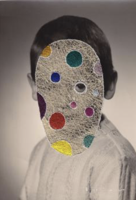
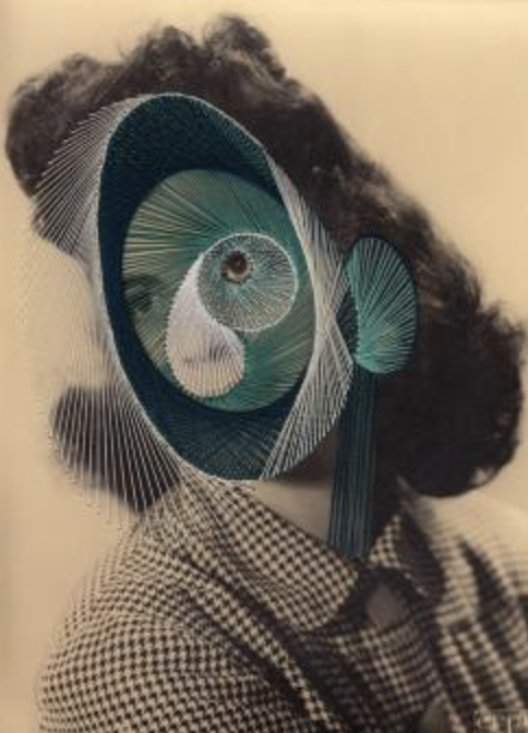
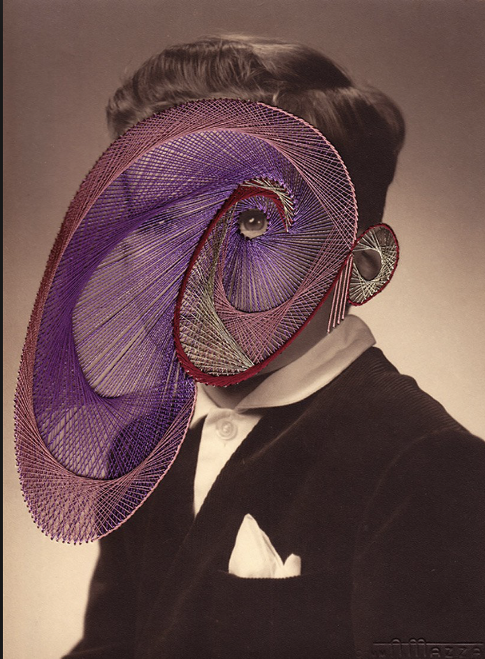
Looking into the threshold concept of disguise I think Maurizio fits for it perfectly. His use of multi media to create a piece of visual art is really beautiful. The three images where the faces are completely sown over are interesting because although they are covered there are big enough gaps between the thred to make out what the photograph is and also emphasis the eyes that arent covered, giving it the impression that the eyes is projecting the thred in all sort of abstract shapes. I like the abstraction of the thread too and the contrasting of the colours. i think its a really unique way to emphasis a small section of a photograph. It looks complexes to create and time consuming which makes the photograph more fragile and colourful.
RESPONSE to Maurizio Anzeri
|
This response was something that I had never done before, so it was quite exciting but it was very hard and I do not think I undertook the concept behind sewing over the photo or adding new elements with thread. The outcome was privy and I liked how it came out in the sense that it kind of put everything together. I thought that sewing on the photograph would be too much and would make the photograph look too busy but in my opinion it just looks like something new, that I haven't done before and also cool. |
CAROLLE BENITAH |
RESPONSE to Carolle Benitah |
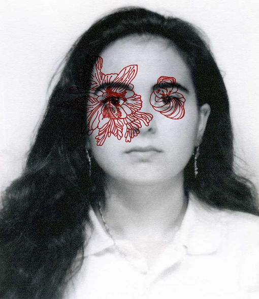
Carolle Benitah has a similar approach to her work as Anzar does. Hers is different in the sense she took her family photographs which she found in her home and went over the faces with thread and also bled thread through the eyes. But another approach she had was drawing over her images. Her images where black and white as the main course of colour came from the thread or drawing she would interpret over the image to make it one and finished.
|
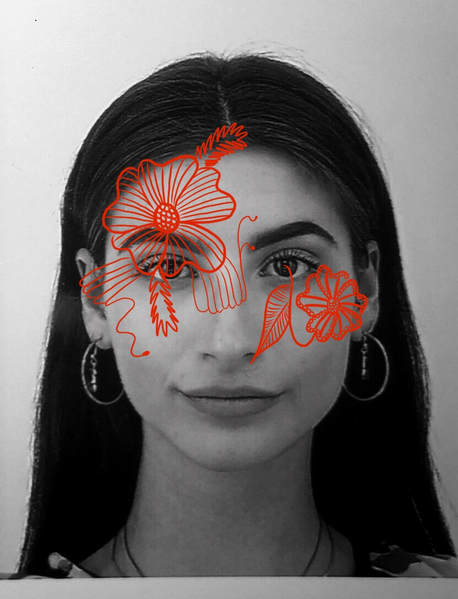
I took a passport photograph of myself. Converted it into black and white. I then imported the photo into pro create on my ipad where i then drawed over it. I chose a lighter red so that its more visuable and noticable because i thought thats in Benitah's photo the darkness of the image over powers the illustration and i wanted mine to be more visuable. I also did not want to do something that was too complect, i wanted my illustration to be clear and simple.
|
EDITORIAL PHOTOGRAPHS - CREATING A DISGUISE:
Most commonly, the purpose of a portrait is for the subject to be seen, to be known. Portraits have been a way to remember someones existence and for their present to be noticed when their no long present. I wanted to investigate taking that away from portraits. Covering the faces, so that they are known seen or noticable. How would it chnage the ideal of the photograph? I wanted to use disguise as a way to manipulate and potentially lie to the viewer. I used editorial techniques on photoshop to add colour or to exggerate a part of the subject. I focuse alot on hiding the face as a whole. That is easy to be told its a person but who it is, is unknown.
|
|
|
|
SELF PORTRAITS
As a young photographer, investigating into portraits is hard because, to find models or people who have the time for you to photograph them. As this was an issue, i started to think what i had which i could use instead 24/7. Myself. I started to take the knowledge of portraits and start looking into self portraits. I know in my skin i am comfortable with taking photographs of myself. I do it all the time! For me it is a comfort zone for me to take my own photographs of myself. This is because i know myself, right. I like to believe that i know all my most attractive angles and positions which make me look and feel comfortable. But that is too easy. I was thinking to myself, how uncomfortable do I feel when other people take photographs of me, it always results in an image i do not want other people to see nor do i feel like i look beautiful in the photograph because of how hard i possible am on myself. As a young female in the 21st century, i also feel as if social media as played a role in the reason why i feel uncomfortable with seeing myself in photographs other people have taken of me. To me i see photographs on social media and expect my pictures to come out as good, as a bad trait that it does not work like that. I have since thought to create self portraits where, other people photograph me and i and put out of my comfort zone, to be able to express myself as myself, and the way I look. Linking back to why portraits became so significant, was because people wanted to be remembered and for younger generations to be able to put a face to their past relatives or family members. They did not care on how they looked, as how they looked in the real world was how they wanted to be presented and remembered. With no photoshops nor manipulation to fool the viewer to thinking the image it reliable. I want to create a source of remembrance for my 17 year old self, the way i look now and i want to be able to present then in a way of a source of light. possibly light boxes, to symbolise that i have broken out of my comfort-zone and allowed myself to let other people photograph me at any angle the want. Still including the surreal aspect to my work. I want to pair my photographs with photographs of objects, which relate to either the portrait or my mood/emotions towards the portrait, via the colours involved in the photograph or the subject. Pairing the photographs, I want to make them into dyptchs, as they are two connecting images to make one, to make one image and to present one story line.
|
|
|
|
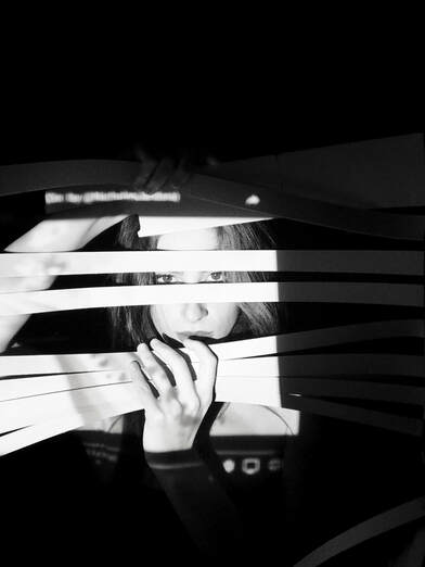
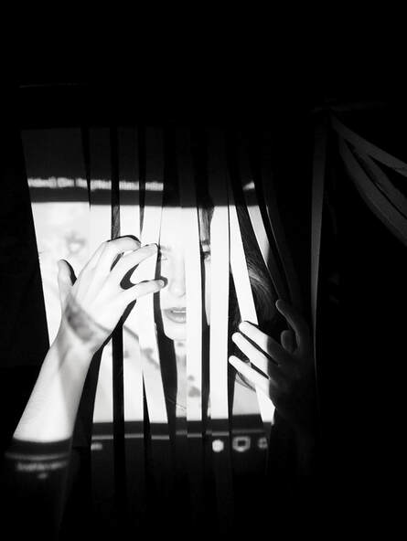
PROJECTIONSPROJECTION: "The presentation of an image on a surface"
For my first set of self portraits I wanted to disguise myself using projections from a projector and which i was the surface. I had not used projection before so I thought it would be a good place to start, when starting to experiment, mixing self portraits and disguise. I was not too keen on what sort of images or videos I wanted to project. I originally started using scenes from some of my favourite films such as 'scarface' but it was too over powering and for some reason led my camera to not focusing. So I adapted and thought to use patterns and then I thought back to when I would watch "tripping videos" with my friends in year 8. So I youtube some and stopped the videos at certain points I thought would look good when projected over my face. Although my face was not completely covered and still noticeable, it still gave off a surreal approach. I also Liked how to colours looked and how the patterns in a way intertwined with my face and positions. |
EDITED (NARROWED DOWN TO THE BEST ONES) IMAGES:
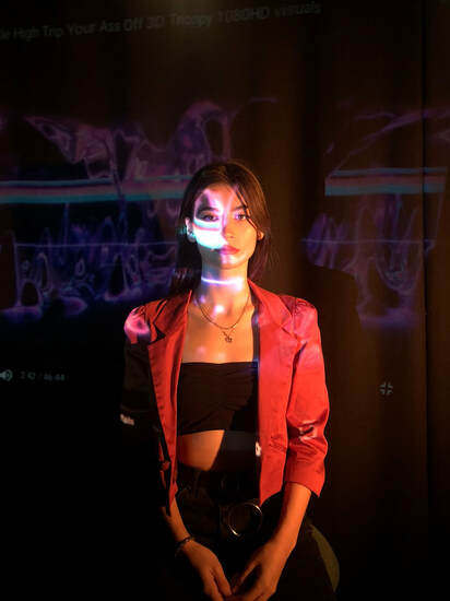
Trippy youtube video. Including patterns. Half covering face. Video bar still on show. noticable its a video projection. Done of purpose.
|
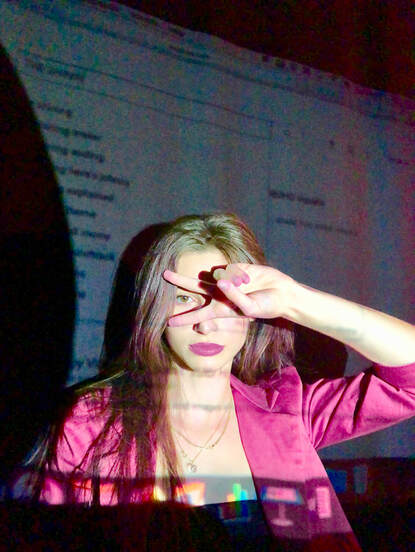
Computer screen projection. Google search bar. Drop down.
|
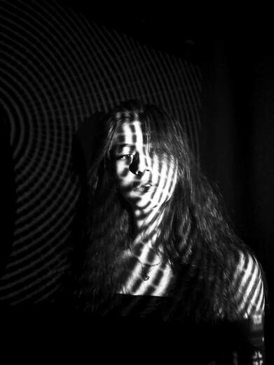
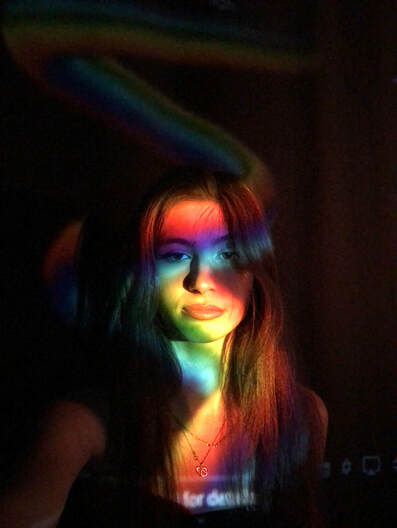
I projected a pattern from a psychedelic video onto my face to create this interesting illusion and to also manipulate the appearance of my face and how it is viewed to a viewer of this photograph. What i thought was surreal about this photograph is that although my face appears to be drowning in these abstract lines, the key features of my face (eyes, nose, mouth) still stand out and can be clearly seen.
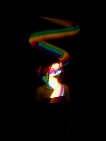
This photograph came out a lot better than the one before using this wavy projection. It could be seen as the porjection represent me, my soul and personality. The light that i give off! I enjoy this photo the most as it can be interpreted in so many different ways.
|
This outcome was my lease favourite because it looks to simple and does not say "surreal" to me because its too obvious that there is a projection over my face. Its not that interesting either. I retook this photo in the one below on the left to see if i could make it look more alluring.
This photograph is one of my favourites from this set of photographs. This is because
|
|
|
The video used for the pattern projections. Taken from youtube. This video was effective because the video is over powering and covered my whole face. The colours were vibrant and neon, drawing attention to the image and making it look unsual, the response i wanted.
|
MOVEMENT WITHIN A PHOTOGRAPH:
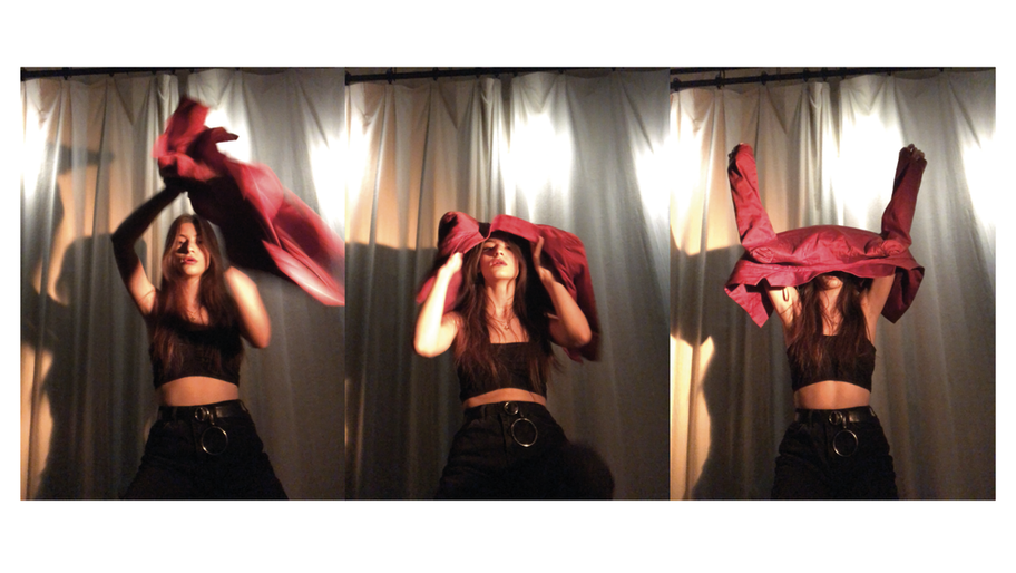
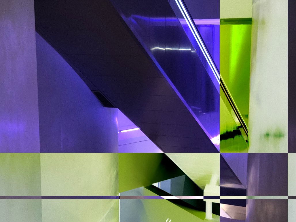
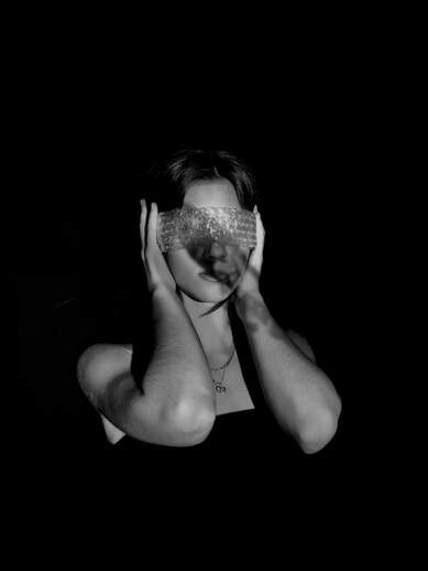
This images where taken from a low angle by a college, with no projections. They are candid photographs, which focus mostly on movement of the subject. The image is like a story line with a slight plot twist. Theres a start, where the subject is starting to put on a jacket, then unexpectidly ends with the jacket not being put on properly but covering the face. This triptypch is showing steps towards the disguise. The cover up. I am thinking of printing this image out, tearing it then placing it back together then also going back to my 'HELENA ALMEIDA' response and painting over my eyes, in the first two images so that the whole image presents the 'unknown', disguise.
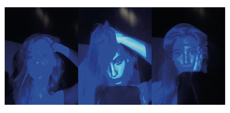
These images were taken with projection, but only of the simple blue light that the projection shows, when theres no source plugged in. These photographs were again taken by someone else, but this time more close up (still at a slightly low angle). We wanted to do more close up images because i wanted the contrast of the blue shades (the light baby blue colour and then the darker and then even darker blue), to be shown clearly. I also wanted my facial features and face in general to still be clear. The blue tint, and different shades of blue also emphasised the texture of my hair, exaggerating the the volume and individual strands of hair. This triptypch i feel, completely presents a sureal approach to a portrait.
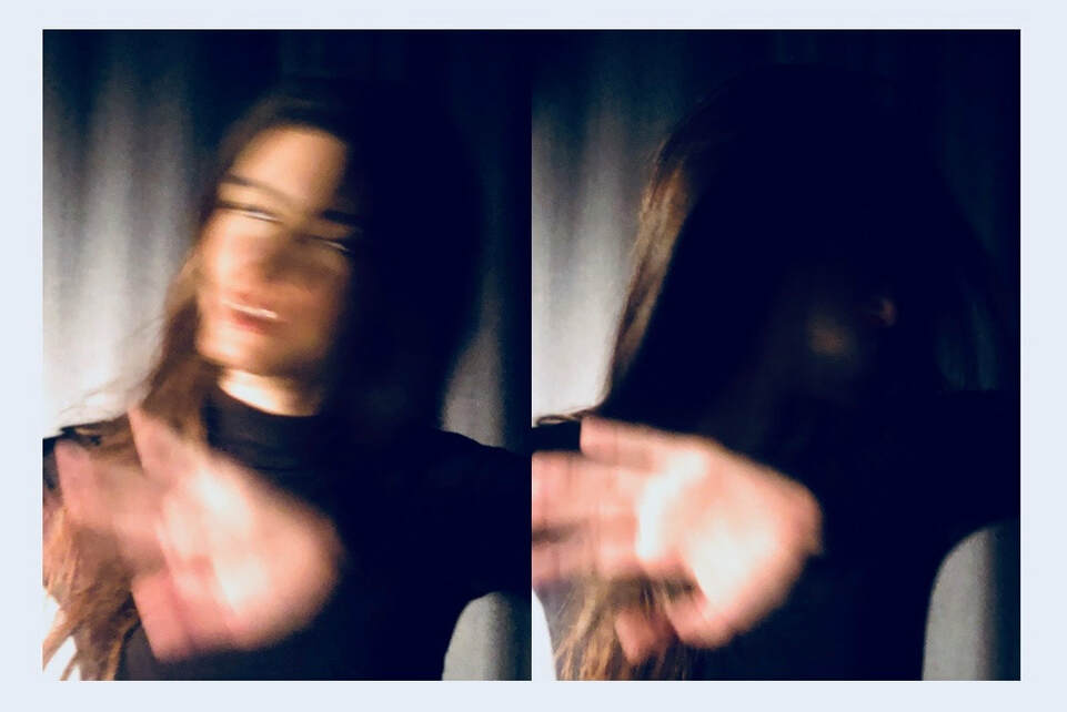
This dyptch, is slightly similar to the first triptych because it focuses on the movement of the subject. What I think works mostly with this image is that, although in the first image, the face can be seen, it cannot be seen at the same time. The movemnt is too quick for the viewer, i also think the movement has led to an unique position andf also how to face is represented. In a way the face looks, some what scary, the eyes are all white, with no detail. These images work together because of the hand in the foreground. I only move slightly but the whole head/face completely moves and disappears into darkness. Its slight muysterious. The grainy effect of the photographs emphasises the movement.
STOP ANIMATION - MAKING IT PERSONAL
|
Lightbox Animation from Thomas Tallis School on Vimeo. |
I wanted to create a stop animation as a way to represent myself as a young individual who is still trying to piece them self together. Using the one of the images from above, I firstly printed it out on acetate and in a colour which would work perfectly when placed onto the light box, in this case I chose to print it in an electric blue colour. I then placed all the cut out parts onto the light box and the gradually started piecing the photograph back together. The stop animation did not come out perfectly which was intensionally and also presented the wrong way up. The reason I done this was because I wanted to represent that even when someone (me) is close to figuring something out there is also something that isn't perfect about it and I wanted to be realistic with this idea of "piecing yourself together", it cannot be done perfectly or also be done at all, that it is something that is always changing or developing, which is where the ending comes in when all the other abstract cut outs interfere which the stop animation because they represent those obstacles in life.
|
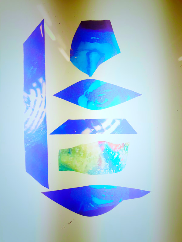
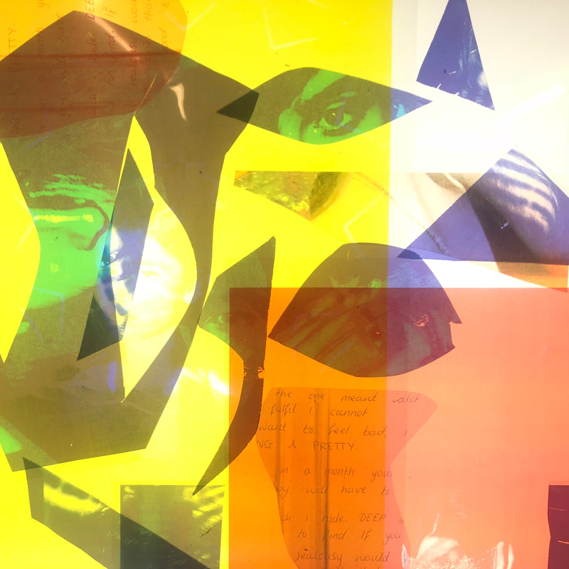
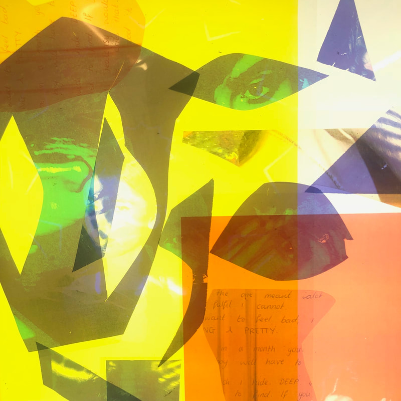
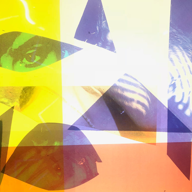
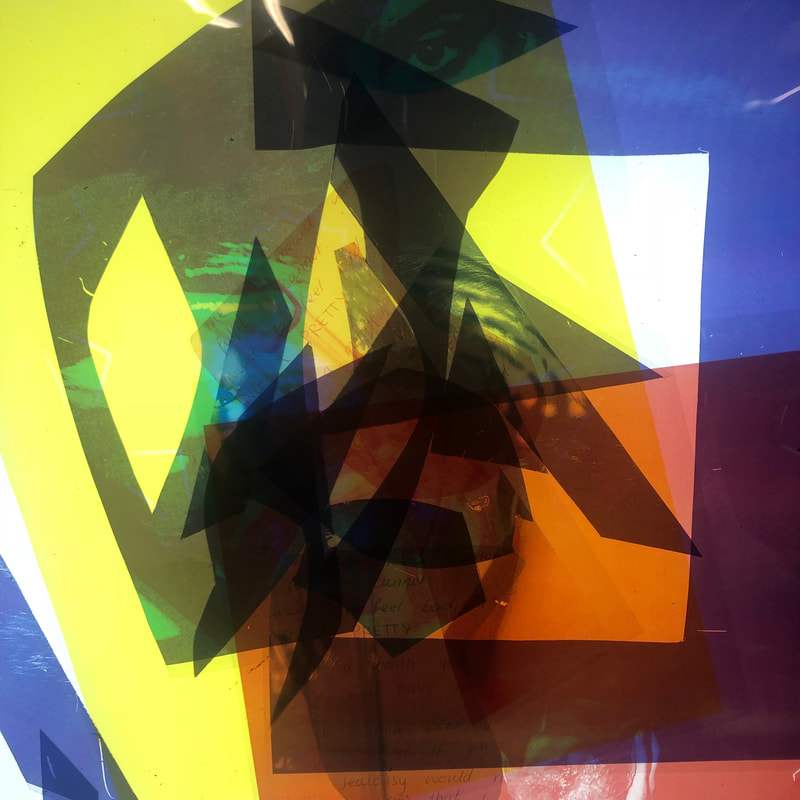
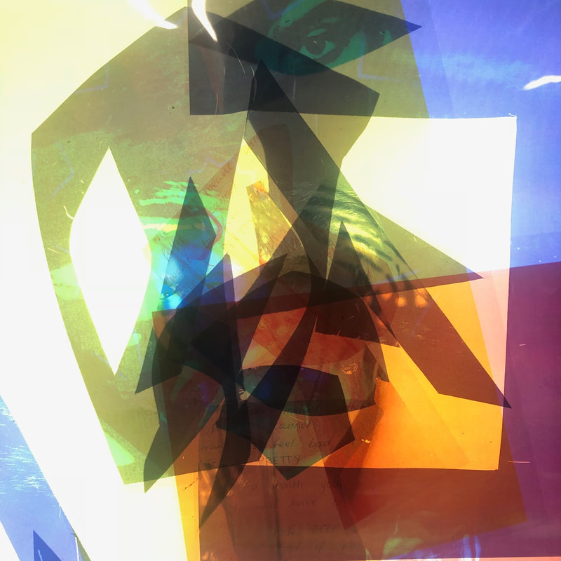
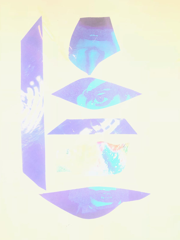
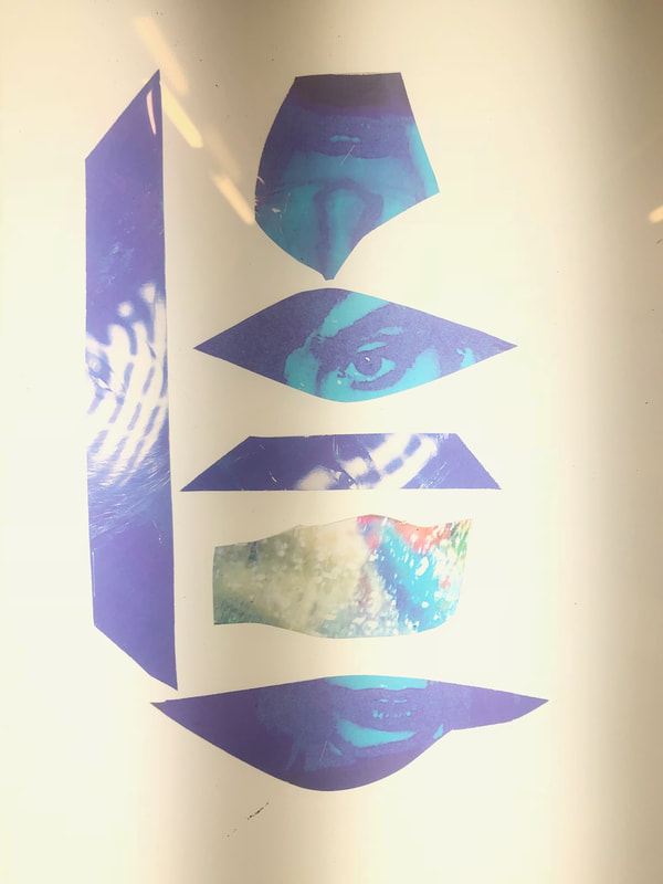
LIGHTBOX ABSTRACTION:
This was an experiment which I conducted on the light box. I printed out the projection images from before on to acetate and then cut them all up or cut parts/shapes out to distort and manipulate the original image. I also printed them out using different ink colours to enhance the colour once placed on to the light box. I wanted to be quirky with this experiment, manipulating the face and adding text. Overall the outcomes were really interesting and came out with the abstraction that I wanted them too but I did not feel a connection with them to create more or to further use them in my investigation. There was a lot of facial features which I did not want to incorporate because it took away the concept of disguise which I wanted to be fluent throughout my hole component one investigation.
One thing that I do like about this set of photograph is that they have many perspectives and that it is kind of down to the viewer on what the image is about. Because there is so much going on there could easily be so many things sed or thought about these images, as a collection and or individual images. Each easily have a different story to tell and that the story is open to variation to what the story actually it.
One thing that I do like about this set of photograph is that they have many perspectives and that it is kind of down to the viewer on what the image is about. Because there is so much going on there could easily be so many things sed or thought about these images, as a collection and or individual images. Each easily have a different story to tell and that the story is open to variation to what the story actually it.
FRANCESCA WOODMAN
Francesca is an American, Female photographer. She is most known for her black and white portraits of either herself or other females. Photographed both naked and clothed.. Her work flows by the movement she captures in her photographs, blurring them and manipulating the subject in a way. In her other pieces her subjects are merging with their surroundings or whose faces are obscured and, or turned away. Looking at her work and the poses of her subjects, i get a sense that they are presenting themselves in the way they want to be perceived/viewed by whom ever is looking at the photograph. The hidden faces give the impression that their bodies are the focus, the movement of it and how its laid in the image. Their nakedness expresses that they're just bodies and that they are normal aspects that everyone has, they should not be sexualised and merging them with other aspects of normal everyday subjects e.g. furniture allows you to see that they should be viewed in the same way.
(Note 2 self) sexualise the female body in particular?....
(Note 2 self) sexualise the female body in particular?....
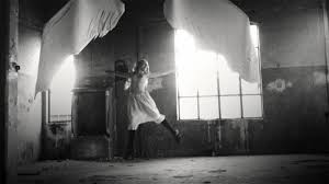
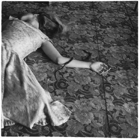
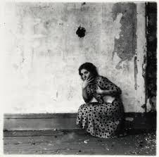
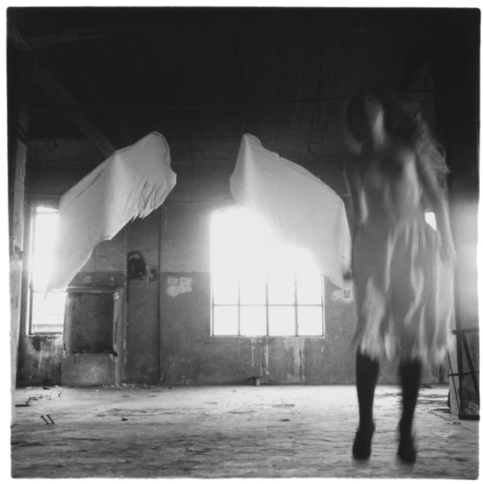
When looking at Woodmans' self portraits i see alot of movement and focus on her body. The movement of the body, although there are portraits where she is still. I like that she has taken her photographs inside abandoned places/houses and that there is ruin all around her. The hidden faces in her work allow the viewer to focus on the body. The nudity represents how the female body is viewed and that she is perceiving it in a new light. Her work is really inspiring as a young women, it is showing me to not be afraid of showing my body and that I can show it however I want it to be perceived. Because I am looking into self portraits I have mostly looked into presenting my face in odd, surreal way and this has inspired me to be more open with my options and that my self portraits do not have to just focus on my face, in fact it shows me that I don't have to show my face at all to present an affective surreal self portrait.
RESPONSE PHOTOGRAPHS TO FRANCESCA WOODMAN.
I wanted to focus on the female body and the movement of the body when doing my response. I also focused on the gradient and contrast between black and white within my photographs, i made them more grainy than Woodmans because I focused on the body close up rather than the body in an open space (in an landscape) and so i enhanced it and made the structure of each photograph more intense to emphasise small details that could get missed. I also did photograph photographs where my face was in it because not Woodman did have some self portraits where her face was showing. However, I do not think my responses are exactly like Woodman's but she did inspire a new path of me taking surreal portraits and also showed me a new way of surreal portraits. I decided I was going to use these photographs for my final outcome for component one.
When taking these photographs I kept referring back to the one which Woodman had created. I wanted to capture the similar movements and aesthetics which she captured. Once I was happy with the photographs, which were originally taken digitally and in colour, I then took into photoshop and edited them. I changed the photographs from colour to black and white making sure that there was a perfect contrast between the two which would be important for the next thing I was planning to do with the photographs. I also made sure that there was a good amount of greys but that they were not too light and slightly more dark for a good gradient.
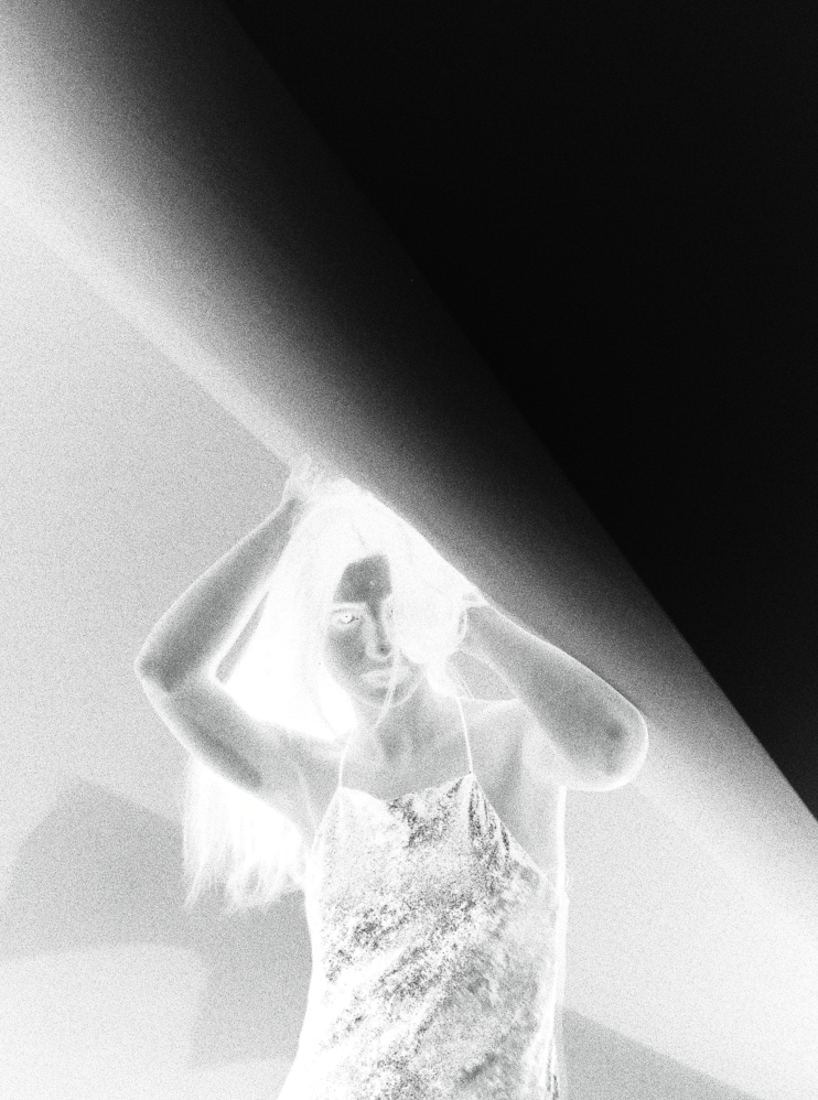
INVERTING:
After editing the photographs I then inverted some. I inverted some so that they would be the right way around when I make them into photograms. I did not invert all of them just because I did want some to be negatives which would add to the surreal effect. To invert the images, I individually placed each image into photoshop and then went to 'images', 'adjustments' and then 'invert'. I would at this point be given the control of how much black, white and grey I would want the inverted image to have. I repeated this with almost all the photographs that I had taken.
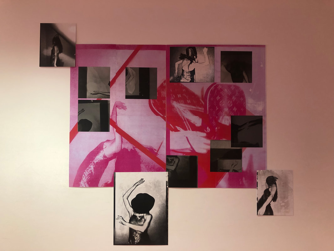
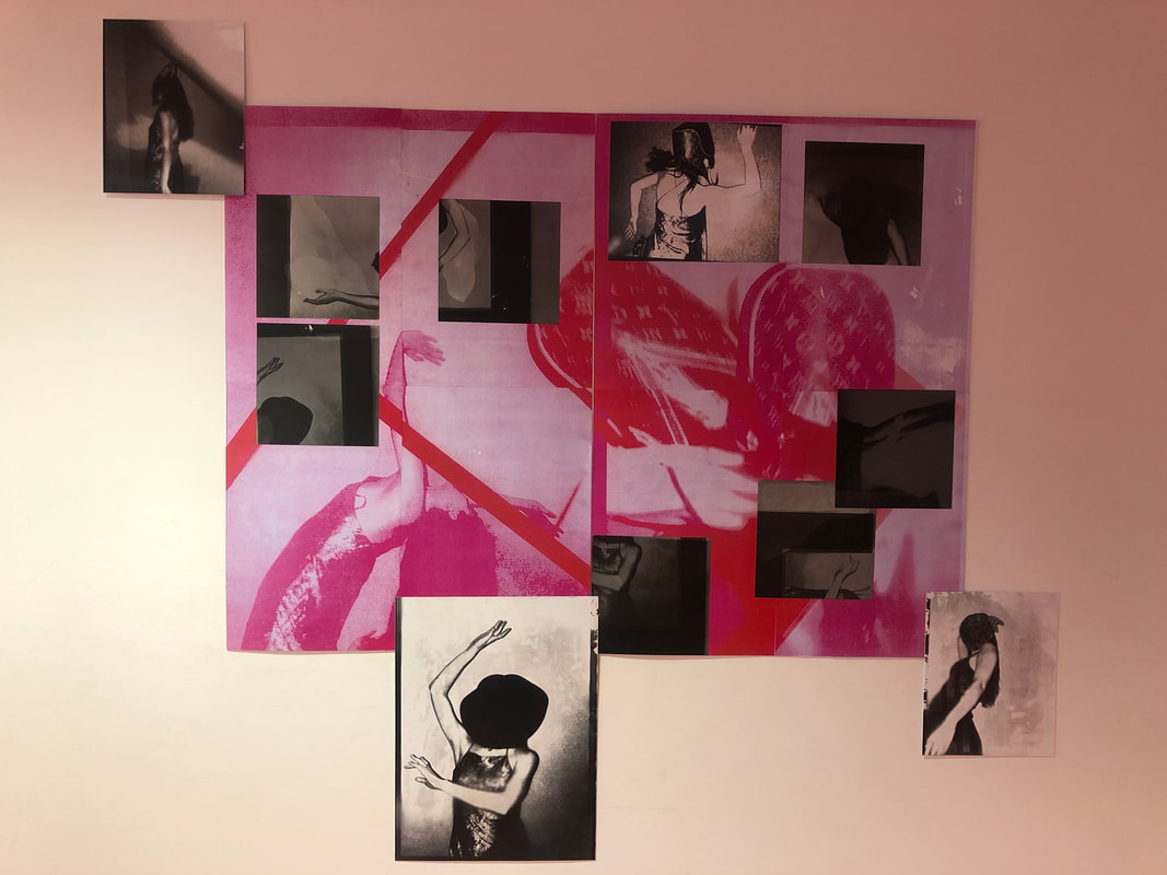
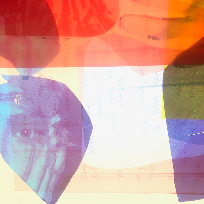
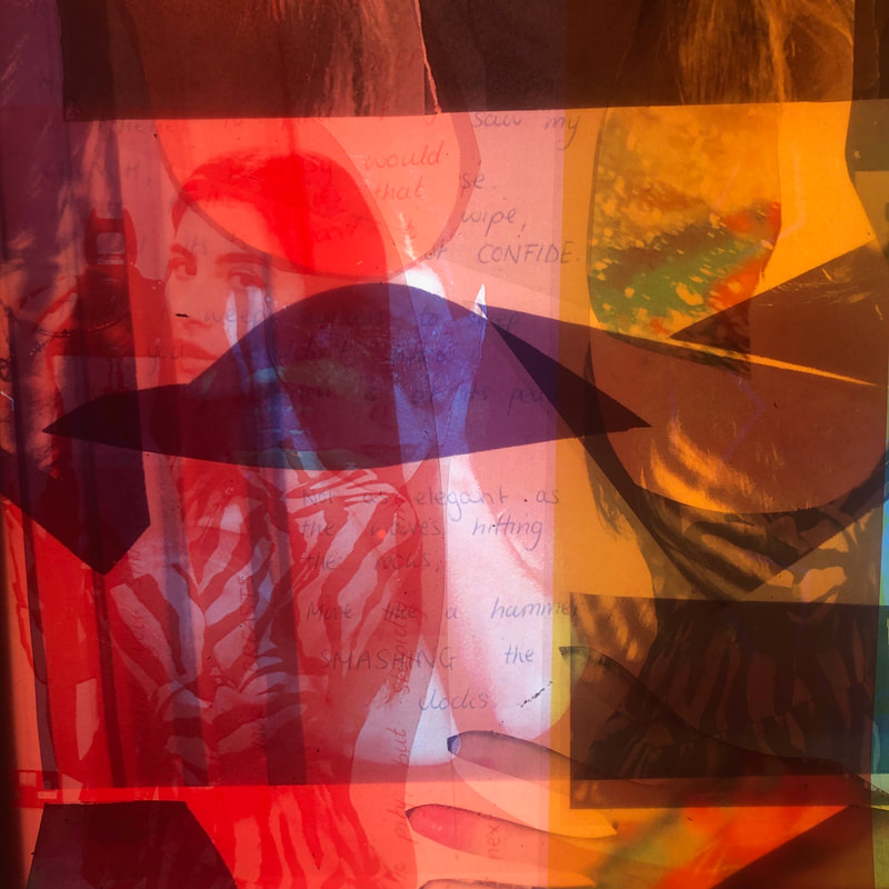
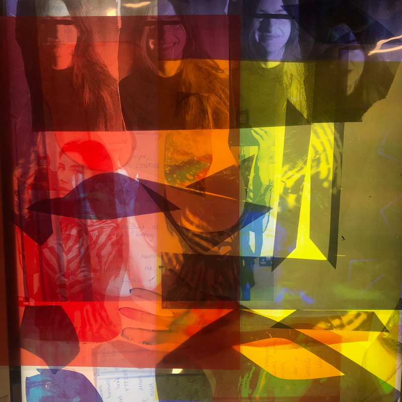
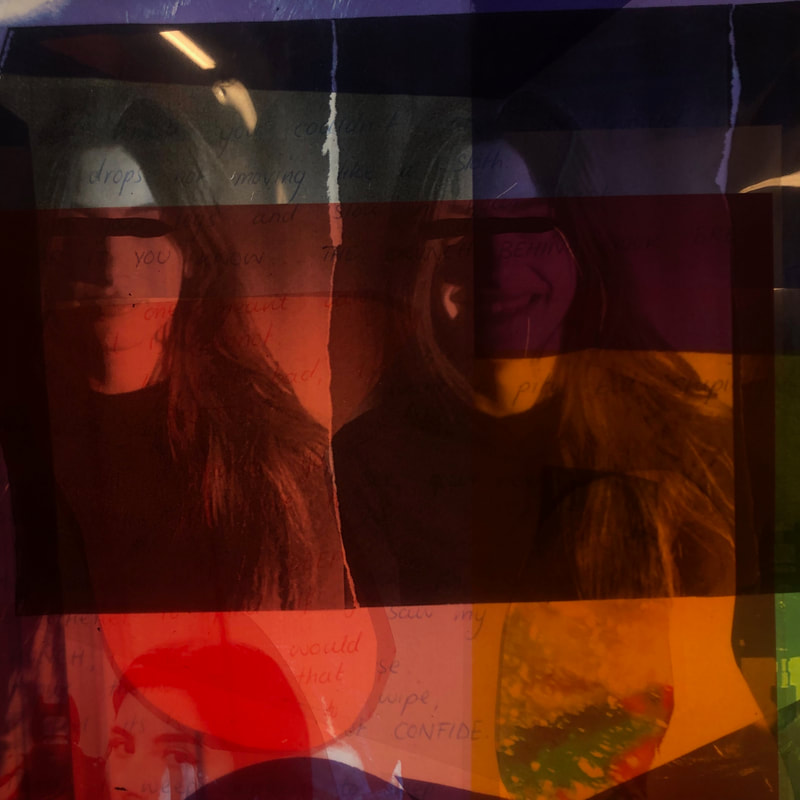
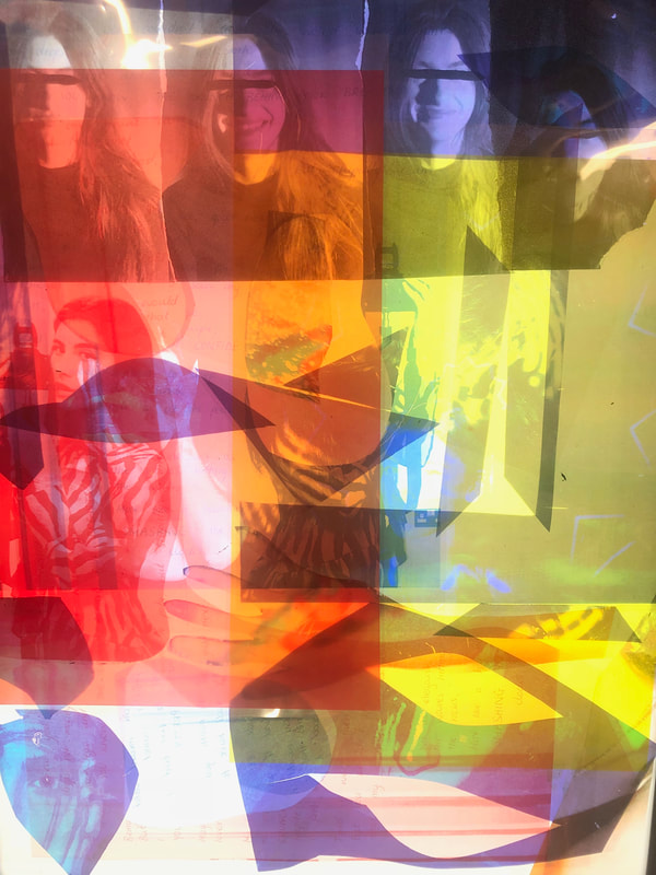
THE FINAL PIECE:
EVALUATION: For the final outcome I overlapped two of the images which I created, inspired my Woodman over one another when scanning them into the printer and then printed them out in a magenta/pink, I chose this colour because I wanted the A1 part to be vibrant and also so that all small details can be noticeable. I also decided to overlap them because I wanted the lines from the photographs to also be part of the whole image, to add abstraction and also to section the image because I thought this would add to my idea of collaging the photographs. The outcome of the large pink A1 photograph came out a lot better than I thought it would because there is a lot of blurriness which to me in away represents a blurring consciousness and makes it look slightly supernatural or gives it a sense of 'otherness' which was something I wanted to portray to maximise the drifting from the 'norm' and what typical social media photography is about when posting self portraits. To scale it to A1 i had to print out 8 A3 sections and then spray mount them together onto board to create the full image. I then used the original photograms which I created in the dark room, of the images self portraits I took, again inspired by Woodman's work. I then spray mounted the smaller square ones on top of the A1 print. The smaller scale photographs were exposed to inspired silky light photographic paper, which gave the finish photograms a really different but satisfying texture. I placed these on top in no specific order but made sure that they linked (section which have hands/arms in them; sections of the body; and then the full body). I then also took A4 prints which I too made into photograms, but with these ones I placed them so they would be coming off the edges of the A1 one print to make the final piece even large but also so that the pink print would not get lost or completely submerged with black and white prints. I chose to stick with the original photograms because they had a really balanced and dark tone contrast between black and white white I though/and knew would work really well with the brightness of the pink and white A1 print.